Feed Layouts
Jodie Miners
Released in Spring '13, feed layouts tries to deal with the issues with very long feeds showing on records.
Release Notes: http://docs.releasenotes.salesforce.com/en-us/spring14/release-notes/rn_forcecom_feed_based_layouts.htm
There is not much to them... yet. I hope they improve on them. Nope, not going to happen - my guess is that there will be no work on Feed Layouts in Classic.
Currently feed-based layouts are only available for Account, Contact, Lead, Opportunity, and Cases (see Case Feeds as they are quite different).
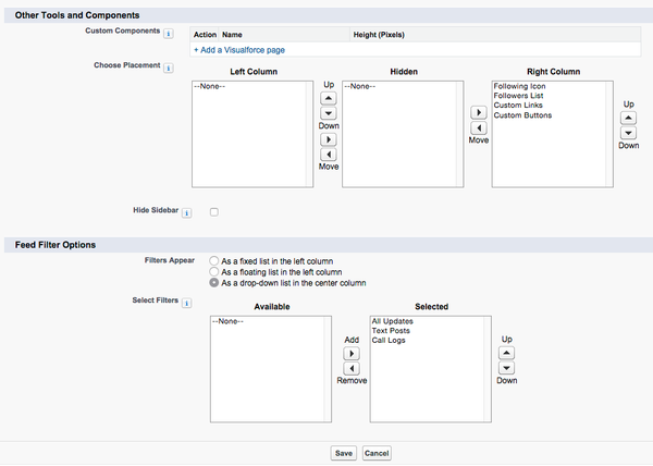
Setup
Here's my recommended setup.
Hover Lists!
As of Winter '15 they fixed the annoyances with the no hover lists on the detail view - but in doing so have completely removed the left hand column functionality - Even for Feed Filters! In fixing something really annoying, they have broken all the other feed layout functionality. Shame Salesforce! Shame! See the Release Notes.
The Feed without the left hand column looks weird, but the functionality is necessary to keep the hover lists, unfortunately.
I have kept both recommended setups - with and without the hover lists.
With No Hover Related Lists - Not Recommended |
With Hover Related Lists - Recommended |
Notes:
| Notes:
|
Here's my sample NFP Org with this set up:
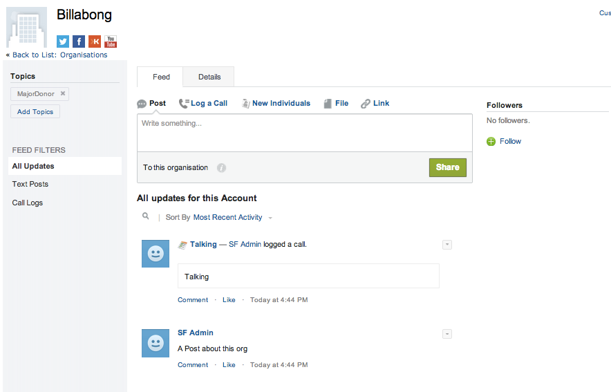
This screen shot is with the left hand nav enabled, so no hover lists.
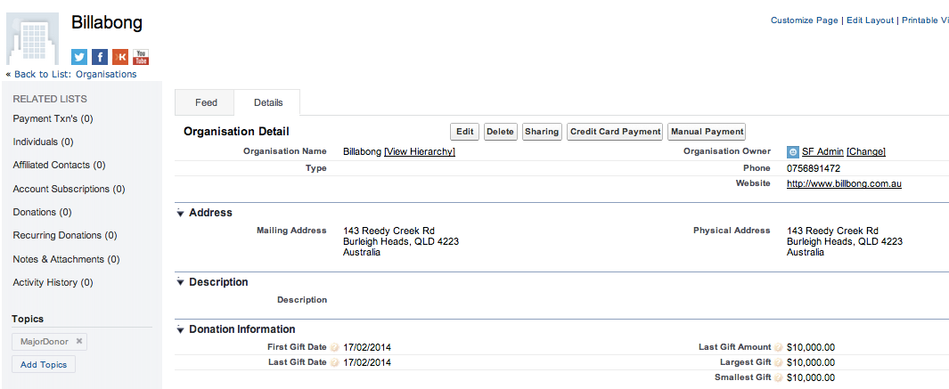
This screen shot is with the left hand nav enabled, so no hover lists - the related lists are clickable in the left hand nav (not very nice for users to use).
Annoyances
You really want the main record details on the feed layout, which means creating a custom visualforce page for every object, with a field set, and then adding fields to the field set.Actually, strike that, it doesn't really work that well at all. It is not as simple as doing a standard component and referencing a fieldset. See http://help.salesforce.com/apex/HTViewHelpDoc?id=case_interaction_custom_components.htm&language=en_US- You have to re-create all your page layouts as feed based layouts.
- It's still two clicks to use the publisher action buttons - but it seems that they can be on the left hand panel in cases, so there is hope that it will come to other objects. (but probably not worth holding your breath for now, since the left hand nav is now useless).
- Like Actions! Global and Quick Actions you have to set them up for each and every page layout on each and every object.
- There is no way (yet) to create your own feed filters. And it won't ever come.
- I don't really like how the related lists appear, if the left hand nav is enabled, but I suppose they are more visible. After teaching everyone to hover and quickly see the related lists, now they have to click and jump down to the related list. Set up the Feed View without the left hand nav if your users use the hover lists. See above for a sort of fix for this.
- I don't like how the related lists appear under the items added to the left column on the feed layout - too many things jumping around on the screen. See above for a sort of fix for this.
Custom Buttons
- Custom buttons merge up into the first button with a drop down list - even if there is no relationship between the buttons - I would call this a bug.
- Note above that there are two custom buttons - Credit Card Payment and Manual Payment.
- Now, if I add the custom buttons to the left (or right) panels in the Feed View, they appear like this
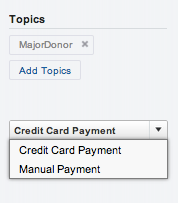
- The Credit Card Payment - the first button only is shown, and you have to drop down to see the other buttons. Weird, Weird, Weird, Weird!
- And then the same buttons are shown on the detail page anyway.
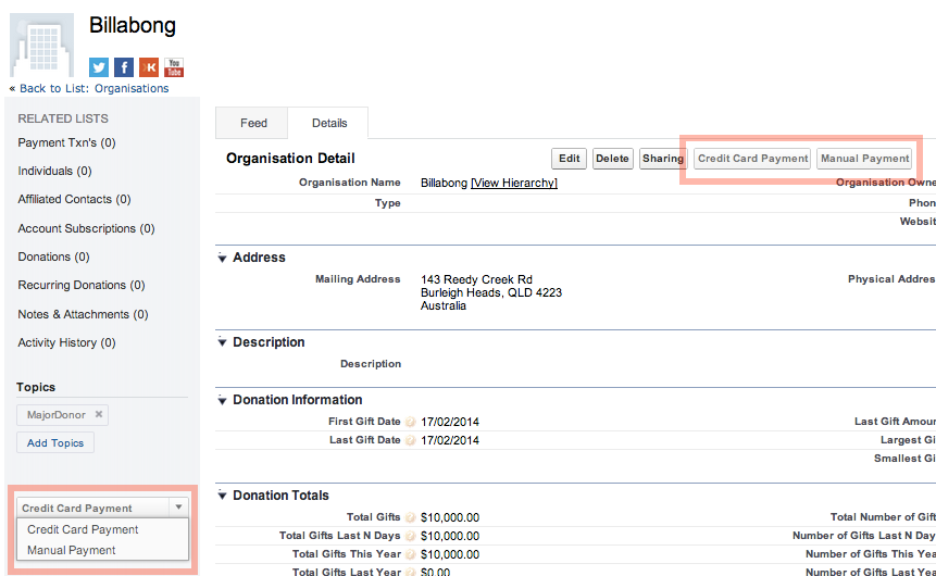
- Even weirder.
I have no idea why this is so.
See also this post Salesforce Case Feed custom button problem, describing a bug with the buttons in Case Feed, and a suggestion from Salesforce to use Custom links instead. This may get around this issue, but it means changing all your buttons to links. And it's not good UI to click on a link to "do something" - a link should "go somewhere".
The buttons in this example are from a managed package, so they can't be changed to links.
My only suggestion is to not put buttons on the left or right hand panels, but to hide them.
Posts Disappeared?
Have your post disappeard? Does your feed default to Call Logs and you have to always change it to All Updates to see anything? Yes? Then this tip is for you! (Says me who had to work it out for myself twice before writing this down).
In the Select Filters box, after you add all (well the only three avaiable - go vote for this idea) the feed filters - if you don't have All Updates set as the first in the list, then it will only show Call Logs or Text Posts and you have to switch to see All Posts.
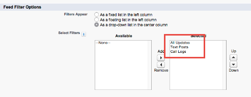
And remember to fix this on ALL your feed layouts.
Feed Layout Ideas
Please go and vote for these ideas!
- No Feed Layout on Contracts! - WTF! Why? https://success.salesforce.com/ideaView?id=08730000000Dge3AAC&sort=2 and Assets https://success.salesforce.com/ideaView?id=08730000000DkWyAAK
- Make the Details Tab first - OMG! Yes! https://success.salesforce.com/ideaView?id=08730000000l6E9AAI&sort=2. NOT GOING TO HAPPEN - this idea has been CLOSED AS DELIVERED IN LIGHTNING! UNBELIEVABLE - it has NOT been delivered at all!
- Allow custom tabs - this will never happen in Classic. It is sort of functional in Lightning now. https://success.salesforce.com/ideaView?id=08730000000l4gWAAQ,
- And the rest https://success.salesforce.com/search?type=Ideas&keywords=Feed%20Layout

