/
Record Page
Record Page
Creating
- You can't seem to clone Lightning Pages yet, which is a real pain. Ooh you can in Winter '18 but it's still a real pain because you can't change the base layout of a page.
- You can't deploy changes made to standard lightning pages via a Change set, so always clone the standard first.
Editing
- Get used to ctrl+F5 refreshing the page multiple times after you have just made one simple change. Or use the Clear Cache Chrome Extension
Lightning Page
Arrangement of the Page
- Oh dear, you can really really create a mess with different arrangements on different page layouts.
- As long as you can say the reason every field or component is on every page, and can "sell" it to the users, and it is useful for the users, then that is OK
Assignment
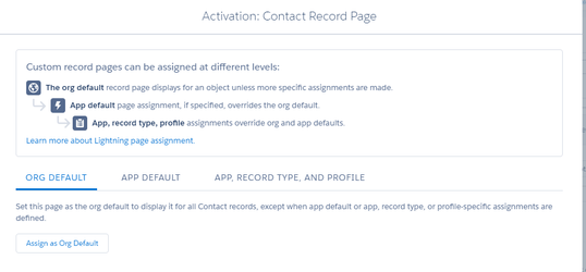
- When you first edit the page, make sure it is assigned as the default page. How is this not standard by default?
- You can create a page specifically for an App (useful), a Profile (use with care), and a Record Type (useful) and any combination of those.
- Use this feature with great care, and just like Page Layouts...
- Keep as few as possible
- Set the naming convention
- Try to modify them with Metdata (I haven't tried this yet though).
- Use this feature with great care, and just like Page Layouts...
Compact Layout
- First thing at the top of the page
- Ensure that NAME is the first field on the CL.
- Or be creative and create a concatenated field here
- Or better still, create a Hyperlinked Concatenated Field - such as Main Record > Sub Record > Sub Sub Record all with hyperlinks back to their main record.
- Get your naming conventions right.
- You can't have a different Compact Layout for different apps, which is highly annoying - it's only for different Record Types
- Each Record Type can have one and only one CL assigned to it.
- Seems to only show 6 fields even if though you can add more fields.
- Create a few "display only" formula fields to show more information in the header.
- You can collapse the Compact Layout - why on earth you would want to do that, I don't know.
Action Buttons
- The buttons on the top right of the page.
- Yes, you can have up to 10 buttons - but don't. See what it looks like, but I think 4 is tops.
- Ensure that you REALLY think about these because this is going to be the main place people go.
- You now need to, on every Page Layout, set up the Classic AND the Lightning Quick Actions.
- It includes Quick Actions AND Buttons from Classic, but not File, Post, Email etc
- Eg Put Edit first. Put Delete last, unless this is a record that is often deleted.
- You can even remove Edit and Delete buttons if you need to.
- Is Record Type often changed? Then ensure that is next to Edit.
- Is Owner changed often? Then put that as one of the first buttons.
- Delete as many buttons as possible.
- (Imagine all the Conga buttons here - they will have to do something about that soon).
- See below for Actions on the Activity tab - they are still edited in the same place which is highly wierd.
- Quick Actions buttons go here too - so you can get sooo many buttons in this one spot.
- Put new Action buttons in front of Edit - name them something like '+ Child Account'
- They look weird in the 3 column layout with no header (Console layout).
- If you use Communities, ensure all the communities buttons are on the Actions bar.
See also Actions! Global and Quick Actions
Left Column - Large
Tabs
- First things first, change tabs around and make Details the first TAB.
- (Unless, this is a small object that is mainly about the related lists and all the fields can be shown in the Compact Layout).
- Remove Related Tab
- Remove the News tab on Accounts.
Details
Quick Links
- Add the new Related List Quick links from Winter '18 to the top of the column that the Details tab is in.
- Unfortunately you as an admin can't control which related lists are shown on the hover list, except by editing the page layout. Be careful when you might want to delete a related list from a page layout in Lightning, but you still have users in Classic that uses it. Hmm, this may be one benefit of having different profiles for Lightning vs Classic users.
- The user can remove some related lists from the hover lists, but I don't reckon many would use this feature.
- The related hover lists show 10 columns! Yay! BUT you can't use mulit edit, or change the column widths and set wrapping like you can in main lists (well, you can set it, but it goes away after the first time you hover off that list - highly annoying).
- Unfortunately the Related Lists still only show stupid 4 columns layout so you still have to be very dilligent in which 4 fields you put first, which may not make sense in a 10 column layout. And still no filtered related lists.
- Only the first 8 links will show up, the rest you have to click More. So put the ones you hardly use, like Activity History, last.
Page Layout
- The Page Layout is the old Classic Layout
- You can have a different Layout for each Profile and Record Type
- So match the Profiles up with your Apps if possible, so the App Lightning Page and the Profile Page Layout are together.
- It is confusing to work out which bits of the profile do what.
- Mini Page Layouts are not used anymore (I haven't tried Console yet). See hovers below.
- Don't put Addresses side by side if you use State and Country Picklists - they are unusable in the full edit screen - they have to go above one another.
Same, Same, but Different
Page Layouts shown in Lightning are the same as Classic, but are quite different in the way you use them.
Whilst I did have a rule of ALL Classic pages to look the same with the same fields in the top panel (see Page Layouts), now with the Compact Layout, we can re-think that.
Also, since you don't have to scroll to see related lists, you may want to put key fields in the top of the page.
I haven't got my RULES together yet, but I will keep adding to this page.
Related
- Add Key Related Lists (eg Related Contacts on Accounts) below the Detail View
- Ensure you set the Related Lists to be List views, rather than card. No one likes cards. Geez.
- Delete the silly Twitter component, unless ALL your users actively use Twitter for business purposes.
- Ensure you add the Files related list.
- Instead of using Related Lists component try multiple Related List - Single components.
- However, the Related Lists must still appear on the page layout, so they will still appear in the Hover Links, which is highly annoying.
Other Tab Suggestions
- Charts if you are going to use many Report Charts - Report Charts are GREAT!
- Key Details - an Action that only shows an Action showing Key Details first - great if you have a heap of fields that are needed only ocassionally.
- Depatments - if you need different fields shown for different departments
- Countries or Regions - if you need different fields shown for different regions.
Right Column - Small
Indicators
- See Actions! Global and Quick Actions for more suggestions on what components goes first
Duplicates
- Ensure you add the Potential Duplicates component for Accounts and Contacts at least.
Chatter
- First things first - move Chatter to the first tab - you want to encourage your users to use Chatter, rather than Activities.
Chatter Actions
- Ensure Post is on the Lightning Actions bar or you will not be able to post to chatter - it's very weird when that is the case. (Also ensure Feed Tracking is turned on).
Activities
- If you are going to allow Activities (which is really optional these days) then ensure that Task, Event and Log a call are on the Lightning Actions bar AFTER Post.
- (but see my post on Action Views, Tasks and Report Alerts and re-think using Activities).
- If there is an email address on the object, be sure to include Send Email - right after Post.
Files and / or Notes
- Add Files or Notes Related List - Single component below Chatter.
Example Layout
See also Accounts for key details on setting up Accounts.
Notes:
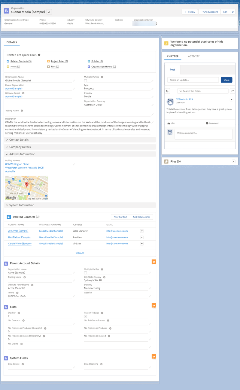
Header
- 2 buttons only shown - show all the + New Record buttons then Edit - the rest of the buttons including Delete are under the dropdown.
- Compact layout shows Recrod Type and Owner
Left Column
- Details Tab only
- Related List Quick Links at the top
- Details Component below
- Include Addresses stacked rather than side by side if using State and Country picklists as they are impossible to edit if you use the Edit button
- Then key Related Lists - such as Contacts below Details
- The Parent Account Key Details that is displayed only IF there is a Parent Account
Create a new checkbox formula field - Has Parent
NOT(ISBLANK(ParentID))
- Then conditional Related Record Components - these are only available to System Admins. See Actions! Global and Quick Actions for details
- Other tabs for key details, charts or other Actions as required.
Right Column
- Indicators can be displayed first. See Actions Examples for more ideas.
- Duplicates displayed front and centre and always in the same place.
- Chatter tab first. Actions Tab second. See Action Views, Tasks and Report Alerts for why!
- Only a very few really important components should be displayed before Chatter.
- Files (and / or Notes) below Chatter.
See Also Contacts for a sample Contact page.
, multiple selections available,
Related content
The Fancy Contact Page
The Fancy Contact Page
More like this
Report Chart Component and Record Reports
Report Chart Component and Record Reports
More like this
New Salesforce Org
New Salesforce Org
More like this
Dynamic Forms and Dynamic Actions
Dynamic Forms and Dynamic Actions
Read with this
Tips and Tricks for Salesforce Home
Tips and Tricks for Salesforce Home
More like this
Dynamic Forms Redux
Dynamic Forms Redux
More like this

