Get this Component on Github https://github.com/JodieM/Indicators
Bring some colour and visibility to the data on your Lightning Pages. Allow users to see at a glance what this record is about and what it's status is. This component is highly customisable and can be used in many record pages.
The icons are based off the standard Lightning Web Component Avatar.
This is my very first component so it may be a bit rough around the edges, and I welcome pull requests for suggestions on how to fix or improve it. But be kind, please.
Version 2 released! Now handles FALSE values!
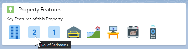
Example Images
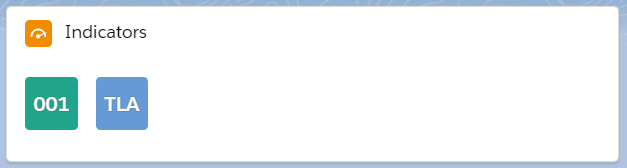
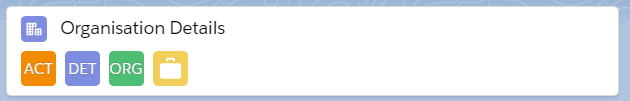
Default view after adding the component to the page
(except on Cases as the Case object does not have a Name field by default).
Suggested placement and usage.
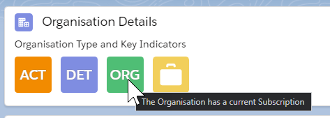
Hover Text
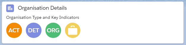
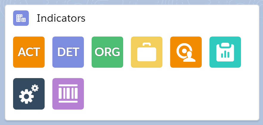
Large Round Icons
Small Square Icons (no heading)
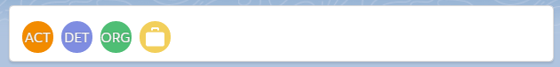
Strip - Small Round, no heading, no title, no icon

Long strip
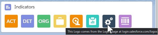
Lot’s of Icons
A few too many?
Funky icons to tell a story (this one might be hard to make to be as flexible as it needs to be).
Icons from https://icons8.com
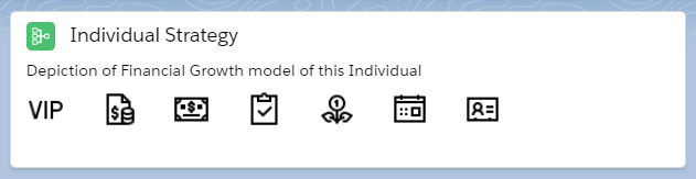
Serious business icons.
Icons from https://icons8.com
Using the Component
Add the indicatorList Component to the Lightning Record Page.
Enter the Settings for the Lightning Card:
Title - Not Required, but looks best if it is defined
Icon - Not Required, but looks best if it is defined - the icon name from SLDS Icons or default icons such as standard:account, standard:opportunity
Heading Text - Optional - the text to display above the icons
Icon Size - large or medium, defaults to large
Icon Shape - circle or base (square), defaults to base
Enter the Settings for each Indicator:
Indicator Field Names - the exact API Name of the field to display - case is important. Separated by a semicolon.
Indicator Icons - the icon name from SLDS Icons or default icons such as standard:account, standard:opportunity separated by a semicolon
Indicator Text Values - the three character (max) text values to show for each icon. Separated by a semicolon. Eg enter ;; if there are 3 icons with no text.
Indicator Image URLs - the full URL of the Image to display, separated by a semicolon. Note: No quotation marks. Image URLs are not applicable for False values.
Indicator Hover Texts - the text to display on hover. Keep it short. Separate by semicolons. No semicolons in the text. Suggest enter Something like
Status - Green: Active - Red: Inactiveas no semicolons or wrapping is allowed. Alt text should be less than 50 chars long for good accessibility.Icons for False - if you want the False value to display then enter an icon here. the icon name from SLDS Icons or default icons such as standard:account, standard:opportunity separated by a semicolon. Enter semicolons between all indicators if no False values are to be shown.
Text Values for False - works similar to Indicator Text Values, but if the value is False or blank. This works in conjunction with Icons for False and the Avatar will only show if Icons for False is entered for that Indicator.
After entering all settings, the Indicators should display on the Lightning Page preview and will then change in the preview as you adjust the settings.
Click Save
Test a boolean field to ensure the indicator disappears if False. Test a boolean field with False values to make sure the indicator appears if the boolean is False.
Hint: Use the configuration worksheet (Make your own copy), I've created to help you work out the whole component before you set it up on the page.
Rules
The indicators work with Boolean or Text fields. Date Fields can be used if you enter Indicator Text Values as the value that is shown does not make much sense. Number fields can be used, if the number is not too big, or you use Indicator Text Values.
If the field is a Boolean and the value is False the Indicator will not show unless there is an Icons for False entered for that Indicator.
If there is a value in Indicator Image URLs that image will show. Images do not work for False values.
If the field is a Boolean and there is a value in Indicator Text Values then that text will show. Limit this text to 3 characters max, and Uppercase.
If the field is a Boolean and there is no value in Indicator Text Values the Icon will be shown.
If the field is a Text field and there is no value in Indicator Text Values the first 3 characters will show, in Uppercase.
If there is an Indicator Text Values, the Icon image will not be shown, but the colour will be from the SLDS icon name entered.
There is no field validation to ensure you don't use a combination of entries that look wierd, so if it looks strange, just go back to simple boolean or text fields.
Tips
Create a new Boolean Formula Field - eg Is Active (Is_Active__c)
ISPICKVAL(Status__c,"Active")Create a new Text field that returns a 3 character (max) value based on Picklist values eg
CASE(TEXT(Status__c),"Oh Hold","HLD","Waiting","WT!","Cancelled","X","ACT")Create a Formula for Is High Value Donor (Is_High_Value_Donor__c) and use $$$ as the text or the green money bag icon
npo02__TotalOppAmount__c > $CustomMetadata.ReportingSettings__mdt.HighValueDonor.Amount__cYou can traverse to parent field relationships by entering for example
Account.IsActive__con a Component on the Contact page.The Images can come from the Salesforce Logos page at https://login.salesforce.com/logos/. Copy the Logo URL value. If using images, the SLDS icon must still be entered, but you can enter a default icon like custom:empty
To get icons in non-SLDS colours, use an external service like DaButtonFactory or eg IconS8 rounded square (replace the colour in the URL) to generate an icon with the text and download it. Add it to your Asset Library, make the image public, and grab the URL. You can use the images from the external service directly, but it may not be a good idea long term. But beware, it might look a bit crap mixing with the SLDS colours. You may also need to display an attribution somewhere on the page, depending on where the images come from.
Examples
See Indicators Examples for a full list of examples of each type of Indicator that can be created.
Indicator Ideas
High Value Client / Donor
Is Active
Is Subscriber / Type of Subscriber
Industry
Is Government
Type of Account (Client / Supplier)
On Credit Hold!
Has Cases
High Rating
Is Local (eg in your State / Country, or the opposite)
High Value Opportunity
Opp near Close Date
Contract due for Renewal
SLA Level
Is My Opportunity / Lead / any record
Is Email Subscriber
Is Active Member
Is Lapsed Member
Is Membership Due
Is Event Attendee
Is Employee
Do Not Email
Do Not Contact
Funds in (eg Donor)
Funds out (eg Grant Recipient)
Contact missing key information
Should this Contact exist? (eg has no valid information)
Anything from this blog post
History of the idea of this component
2015 - Christian Carter wrote an excellent blog post on Frostings and Progress Bars or little graphical elements you can use in simple formulas to enhance the visual information displayed on your Salesforce records.
2016 - Weathervane App is released. I had to get an unmanaged package to make it work for Contracts but it was a great app and my clients really relied on seeing the colourful icons on their pages. This component is based off the ideas in this excellent app.
2017 - The Winter '18 Release allowed us to display formula fields on Related Record Components.
2018 - I did a talk at London's Calling about using Quick Actions which featured the Indicators I had created from formula fields. A similar talk was done a few weeks later at World Tour Sydney.
2018 - The Actions! Global and Quick Actions page to go along with that talk includes many examples on where to get cool images for your formulas, but it's not so great to be going off platform to just display a few fancy icons.
2020 - I did the DEX602 Lightning Web Components course (after doing the Aura components in 2018) so decided that this component would be the first one to tackle! It is well worth doing this course.
2020 - Hoping that SLDS Icons would be able to be used in Formulas now, and building upon Matt Lacey's excellent blog posts on using SVGs in formulas, I wrote another page Image Formulas delving into this. TLDR: sort of possible, but not really.
Now - This component is released.
Future - More features to come, if you can help me with implementing some of the ideas.
Acknowledgements
The coloured indicators idea came from the Weathervane App by Christian Carter and Beth Breisnes which was built for Classic and uses Custom Metadata Types. It has a few more features than this Component but it is something we can build upon later. It was a fabulous app but no longer supported as both have moved on to work at Salesforce.
The Setup section came from Clint Chester's excellent Component, Helpful Links Component
Many members of the Salesforce community helped me with writing this Lightning Web Component. I hope I have not missed anyone:
Matt Lacey
René Winkelmeyer
Christian Szandor Knapp
Clint Chester
James Hou
Kyle Crouse
And excellent blog posts or Stack Exchange articles from:
SFDCFox
Salesforce-sas
Rahul Gawale
Here is my question on the Salesforce Stack Exchange to get to the bottom of one of the hardest parts of this code.
How this Component is Created
There is the Card component and the Avatar Component. Try it out in the Lightning Components Playground.
The design attributes take in all the setup values that are needed to display the card and each indicator. I would love these to be in an easier to edit format and potentially in CMDT in the future. Or maybe an advanced setup that is written in JSON (this idea has been mostly rejected though).
The setup checks to ensure that there is exactly the same number of settings in each field, and displays an error if there are any issues. (Thanks Clint for that code!).
The setup strips the semicolons from the field names and creates an array of field names. These are placed into an array with the Object Name (comes by default from placing the component on the page).
The Wire uses the Lightning uiRecordApi getRecord method to return the values from the fields listed in the array. This is how we can use getRecord without hard coding the field names. The optionalFields parameter is used so we do not display the indicator if the user does not have access to that field. (I could not get this working so it’s back to just using fields. Let me know if there is any issue with any errors arising from fields that users don’t have access to).
We use the uiRecordApi getFieldValue method to return the field value as that has the handy dandy feature of being able to traverse up the relationships. (Thanks Szandor for that idea!).
The Avatar component is conditionally rendered to only display if the field value is true (in Javascript that means a boolean true value OR text in a field).
So, a fully customisable, design attribute driven component that returns the fields that you chuck into an array, and displays them in pretty ways. I like it.