Field Type | Field Value | Indicator Icon | Indicator Text Value | Indicator Image URL | Icon for False | Text Value for False | Example Avatar | Notes |
|---|---|---|---|---|---|---|---|---|
Text | Burlington Textiles | custom:custom109 |  | First 3 chars of text on coloured icon. Works for any text or numeric value. Dates will look weird. | ||||
Any Value | custom:custom109 | ABC |  | Text Value entered, on coloured icon. | ||||
Any Value | custom:custom109 | ABC | https://www.lightningdesignsystem.com/assets/images/avatar2.jpg |  | Image entered. Text Value ignored. | |||
Blank Value | custom:custom109 | ABC | https://www.lightningdesignsystem.com/assets/images/avatar2.jpg | Not Shown | All settings ignored because Icon for False not entered. | |||
Blank Value | custom:custom109 | ABC | standard:empty |  | The False Icon only. | |||
Blank Value | custom:custom109 | ABC | standard:empty | XYZ |  | The False Text entered, on the False Icon colour. | ||
Boolean | true | custom:custom6 | ACT | custom:custom100 | IAV |  | These two are the same settings, just different for true or false | |
false | custom:custom6 | ACT | custom:custom100 | IAV |  | |||
true | none | ✔️ | none | ❌ | ✔️ | These two are the same settings, just different for true and false. You could also use a utility icon but they would not be coloured. | ||
false | none | ✔️ | none | ❌ | ❌ | |||
false | custom:custom109 | ABC | https://www.lightningdesignsystem.com/assets/images/avatar2.jpg | Not Shown | All settings ignored because Icon for False not entered. |
Building a Checking Component
So I want a Component that can sit on the side of the Lightning Page and show green ticks or red crosses depending on how much of the record you have filled out. The ideal is that it is just based on a field set, and gets hover data from Help Text but for now, I have mocked it up using this component. It’s not great, and we can do better, so let me know your suggestions.
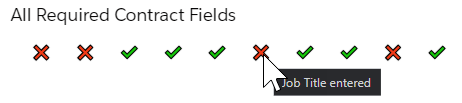
This is set up using the true / false settings above
Field Name | Sample Values | Notes |
|---|---|---|
Title | All Required Contract Fields | This could be in Heading if you want the text smaller |
Icon | (blank) | |
Icon Size | medium | Large is a bit too garish. Leave large for Indicator panels |
Icon Shape | base | it doesn’t change anything since we are using text |
Indicator Field Names | Field1__c;Field2__c;Field3__c;Field4__c;Field5__c;JobTitle__c;Address__r.CityStateCountry__c;Field6__c;Manager__r.Email;PayRate__c | Remember you can use spanning relationships |
Indicator Icons | ;;;;;;;;; | Not actually required to be entered, so just enter the semicolons |
Indicator Text Values | ✔️;✔️;✔️;✔️;✔️;✔️;✔️;✔️;✔️;✔️ | You could use Icons instead of text. Or you can use real text or different emojis |
Icons for False | none;none;none;none;none;none;none;none;none;none | Important to enter “none” (or just a blank space) so that the False text will display |
Text Values for False | ❌;❌;❌;❌;❌;❌;❌;❌;❌;❌ |
How to improve on this
Make the icons closer together when no SLDS icon visible
Use images for False also - I think this has to wait until we do the CMDT setup. There are no appropriate SLDS icons that represent a true and false value - and remember people that are colour blind may not like a green and red icon that is the same colour
Potentially have a setting where you can repeat all icons to be the same but not until CMDT
based on a field set, and get hover data from Help Text rather than having to do all this silly setup! Yes it is silly.